A Clif Bar Bar Chart for Protein
Scraped and visualized Clif bar protien amounts
I eat an unfair number of Clif bars. They’re shelf-stable, generally tasty, and good for a protein boost. If you want to maximize your protein density, however, take a look at my Clif Bar Bar Chart.
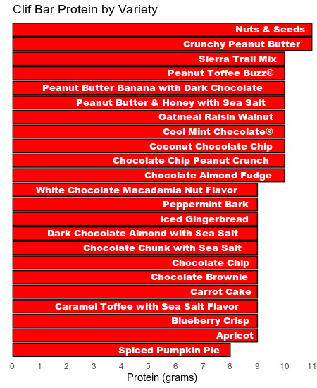
To gather the data, I enlisted Python and Beautiful Soup to read protein call-outs (among other details) from the product pages of clifbar.com. Then I pulled the details into R and used the lovely ggplot2 to customize a visualization suiting the subject matter.
Want to know more about my process? Surprised pumpkin pie is such a slacker? Check out the code and explore for yourself!
Edit: Years later, I’ve added a link to the project’s code repository.